Abstract art is any work that doesn’t try to depict a recognisable person, landscape, or object. It uses colour, shape, line, texture, and gesture as the whole subject - the paint isn’t standing in for something else, the paint is the thing itself. That’s the honest, textbook definition, and it holds up.
It also doesn’t explain why the abstract print over your sofa disappeared into the wall within a month, while your neighbour’s stairwell piece stops guests mid-step on the way to the bathroom.
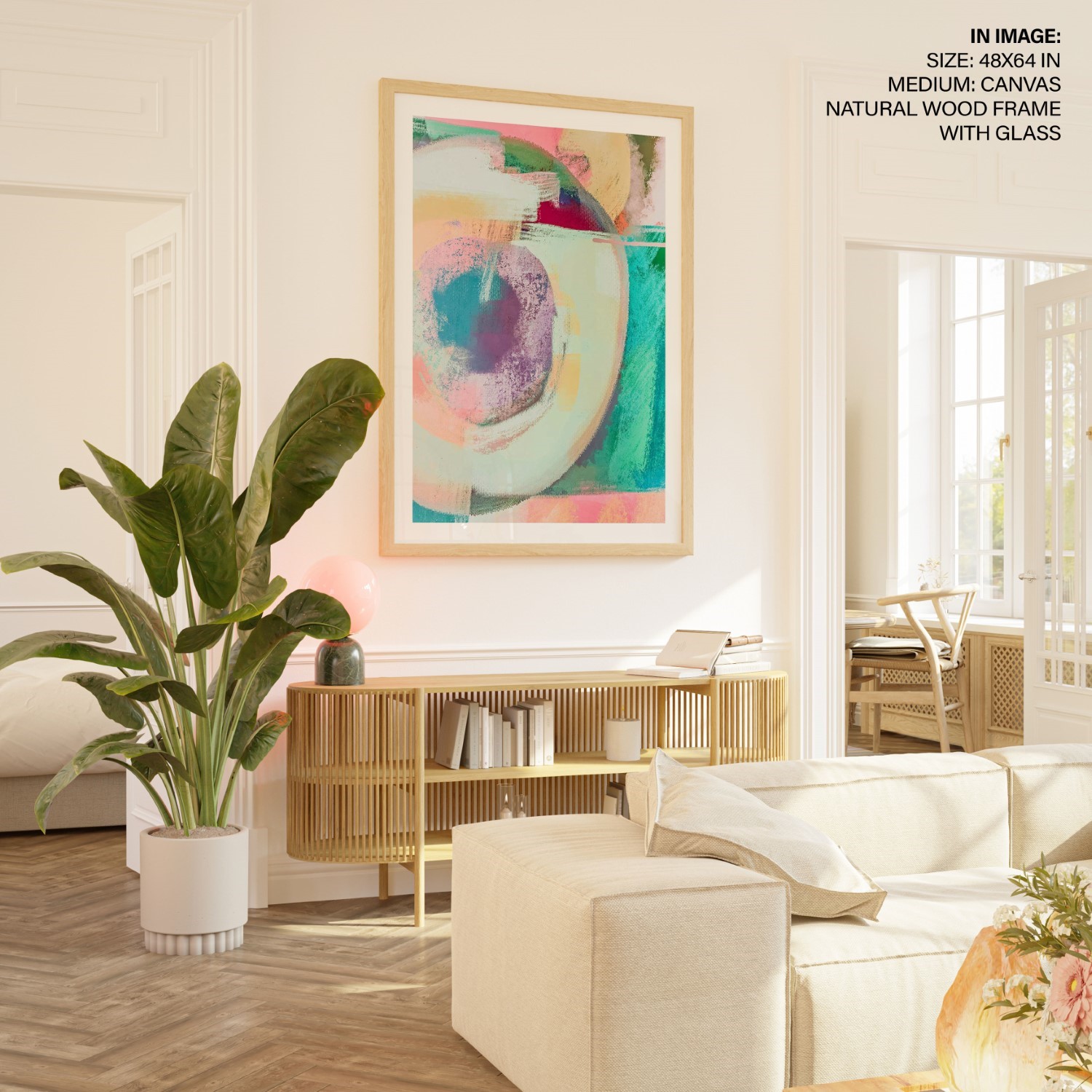
Most abstract art gets bought for one reason: it goes with everything. No faces to clash with the décor, no era to date the room, no colour story to fight. That reasoning is exactly why so much of it disappears - a piece chosen to offend nobody’s eye rarely earns anybody’s attention either. The abstracts that actually work in a room aren’t chosen for how well they blend. They’re chosen for how hard they pull the eye, matched deliberately to how much attention that particular room can spare.
What Abstract Art Actually Is, Briefly
Kandinsky And Hilma Af Klint Made Abstraction A Subject In Itself
Wassily Kandinsky is usually credited as the painter who pushed furthest into full abstraction first, around 1910 - he believed colour and form could carry feeling the way music does, without needing to picture anything at all. He wasn’t quite first, technically. The Swedish painter Hilma af Klint had been making non-representational, symbol-heavy work for several years before him, only nobody saw it: her paintings sat in storage by her own instruction until a Guggenheim retrospective in 2018 finally wrote her into the history most people know. Between the two of them, they set the terms every abstract painter has worked from since - composition with no subject to recognise.
Indian Abstract Art Grew Out Of The Progressive Artists’ Group
India built its own abstract movement inside the Progressive Artists’ Group, founded in Bombay in 1947. Not everyone in that group went abstract - M.F. Husain and F.N. Souza stayed largely figurative, painting recognisable bodies and scenes even as they broke most of the rules about how to paint them. It was V.S. Gaitonde and S.H. Raza who pushed furthest into pure abstraction, and they pushed in different directions. Gaitonde spent decades building layered, glowing fields of colour with almost no representational reference at all, drawing on Zen Buddhist ideas about stillness. Raza went the opposite route, returning again and again to the bindu - a single point or circle, borrowed from tantric geometry, that he used as a stand-in for origin and energy itself.
That range matters more than it looks like it should. Gaitonde’s hushed, meditative fields and Raza’s high-voltage bindu compositions are both, technically, “abstract art.” But they do almost opposite jobs in a room, and that’s the part most buyers skip past when they shop for “an abstract piece” as if it were one category instead of a whole spectrum.
Bold Abstract Art Pulls The Eye; Muted Abstract Art Lets It Rest
High-Contrast Marks Ask More Of The Eye Than Tonal Ones Do
Colour and visual-complexity research has looked at this question for decades, and the association holds up even where exact numbers vary between studies: high-contrast, high-saturation, gestural marks - visible brushstrokes, hard colour breaks, diagonal energy - are associated with higher measured arousal. They ask more of the eye, and the eye stays more alert answering. Muted, tonal work in closely related colours is associated with lower arousal - the eye settles into it instead of working to parse it.
Kaplan and Kaplan’s attention restoration theory offers a useful frame here, even though their original research was about looking at nature rather than looking at paintings. They distinguish between scenes that demand directed effort to make sense of, and softer scenes that let attention wander without requiring it. Apply the same logic to abstraction and the guidance gets concrete fast: a gestural, high-chroma canvas competing for attention across a room is doing the opposite job to a soft, blocked-colour piece the eye can rest on without working.

What The Hospital-Window Study Does And Doesn’t Show
There’s a second thread worth naming honestly rather than stretching further than it goes. Roger Ulrich’s often-cited 1984 study in Science found that surgical patients recovering in rooms with a window view of trees needed less pain medication and left hospital sooner than patients facing a brick wall. That’s a finding about a window, not about art, and it would be dishonest to claim it proves anything about paintings directly. But it’s the study that got designers asking whether what patients look at matters at all - and hospital art programmes have leaned toward muted, low-arousal, nature-adjacent work ever since, keeping anything busy or high-contrast out of recovery wards and waiting rooms.
None of this means bold abstract art is bad for you, or that a muted piece will calm you down. Nobody has proven either claim, and this piece won’t make it. What the research consistently shows is an association, not an effect: some visual patterns pull more attention than others, and rooms differ sharply in how much attention they can spare.
Match Your Abstract Wall Art To What The Room Can Spare
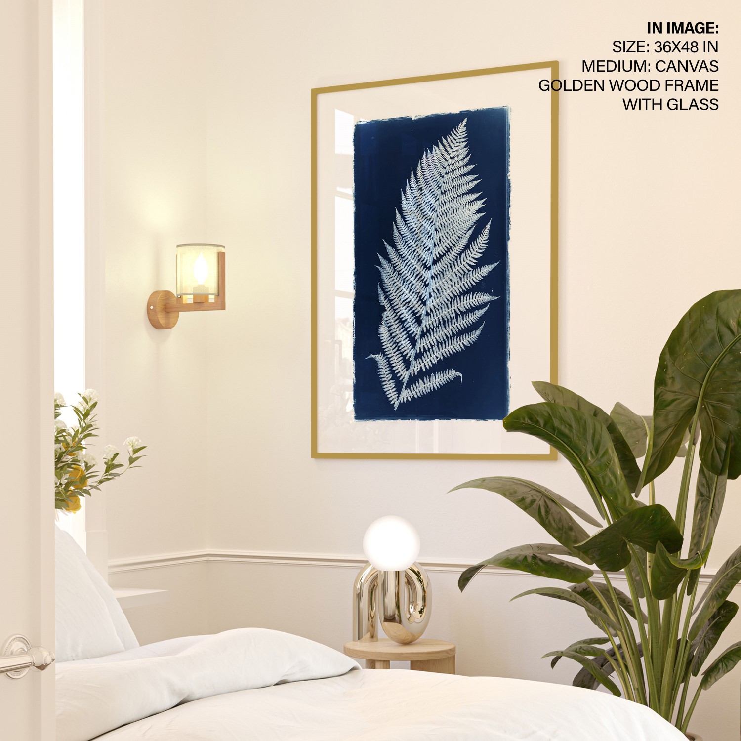
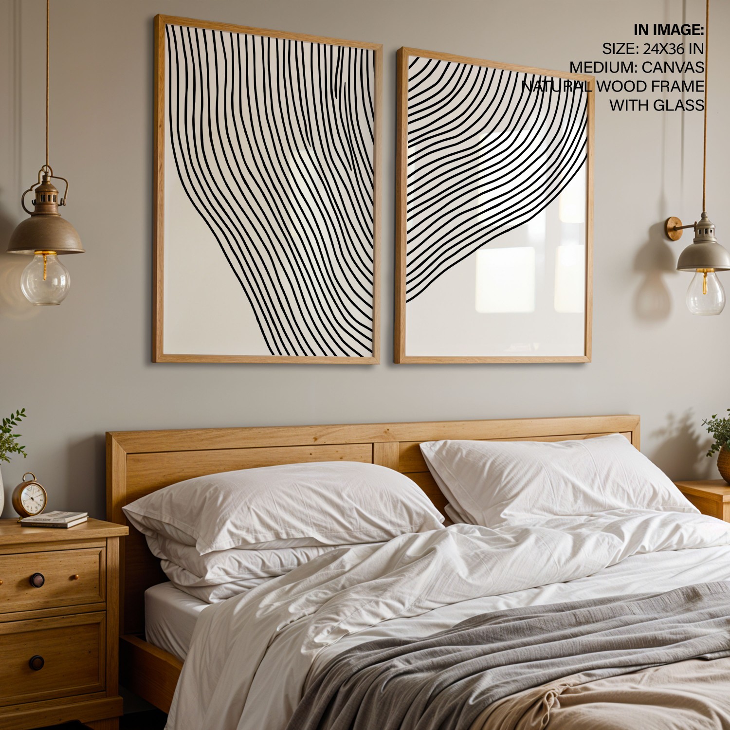
Bedrooms, reading corners, focus-heavy home offices - low arousal wins. Look for: three or four related tones, soft edges, minimal contrast. Avoid: one dominant, hard-edged focal point competing with the room’s actual job of rest or concentration.
Stairwells, entries, dining rooms, social living rooms - high arousal earns its keep. Look for: one bold, high-contrast, gestural anchor. Avoid: two or more loud pieces sharing a sightline - they cancel each other rather than doubling the energy.
Abstract Wall Art For A Bedroom Should Stay Low-Contrast
A bedroom has almost nothing to spare. It’s the one room built around winding down, and a large, high-contrast, gestural abstract over the bed asks the eye to keep working right up until the lights go off. If you want a second, older framework for the same wall, the vastu tradition has its own rules for what belongs across from a bed, worth a look even if you’re deciding on colour theory alone - see our vastu guide to bedroom paintings.
Abstract Art For A Stairwell Or Entryway Can Be The Loudest In The House
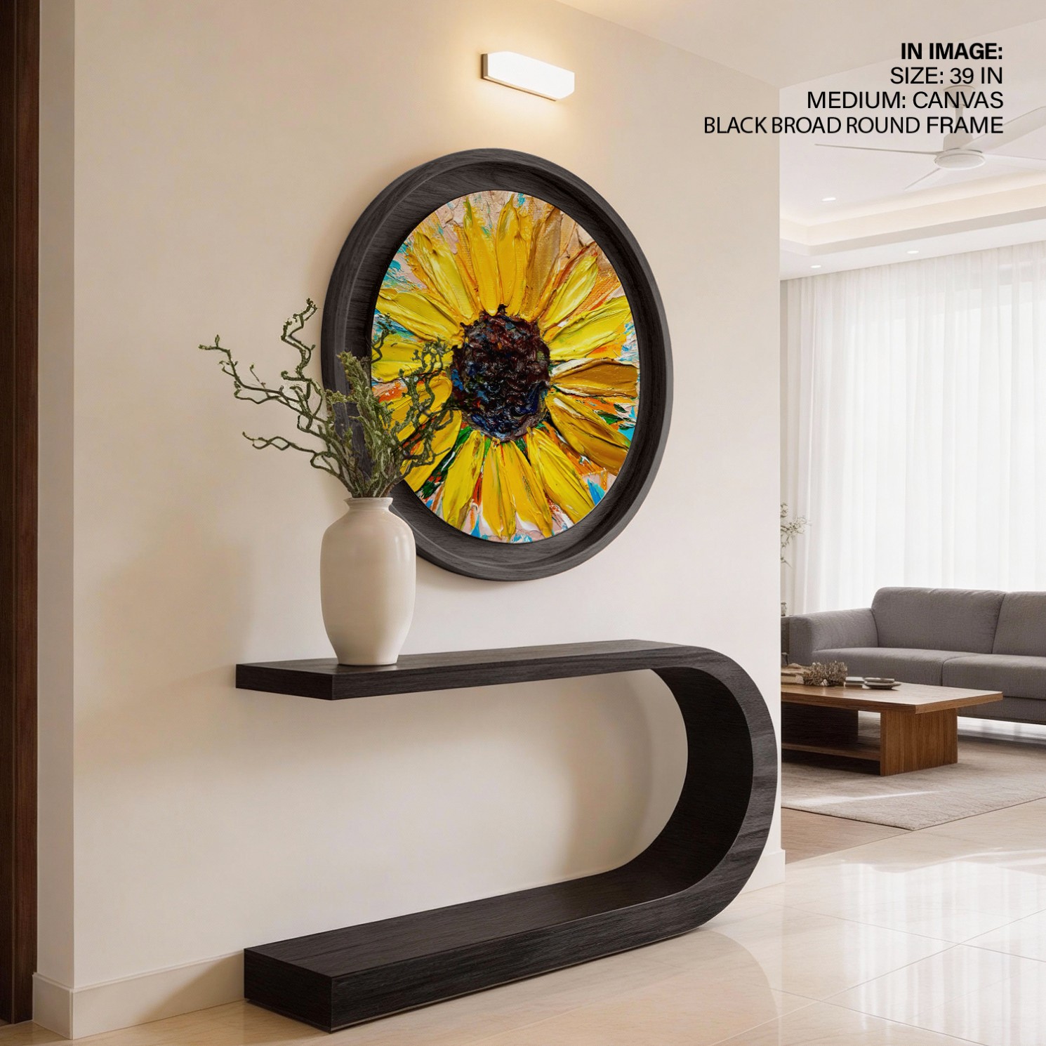
A stairwell, hallway, or entryway is the opposite case. Nobody lingers there, so there’s nothing to protect. That’s exactly where a loud, high-contrast, gestural piece earns its keep - it has about three seconds to register, and it’s built to use every one of them. The living room sits in the middle and takes the most debate, because it’s the room most people default to hanging their boldest piece in regardless of how the room actually gets used; our vastu guide to living room paintings covers the directional side of that same decision.
Abstract Wall Art For A Home Office Sits Between The Two
A home office is where this framework earns its keep the most. Too muted, and the room reads flat through an eight-hour day. Too loud, and the piece competes with the concentration the room exists for. We’ve covered that exact balance in more depth in how art affects your office space, including where the line sits between energising a desk and distracting from it.
Hang One Loud Abstract Piece Per Room, And Let The Rest Go Quiet
Once you accept that different rooms can spare different amounts of attention, the sizing and count question mostly solves itself.
One Oversized Abstract Beats Three Medium Ones
Scale first. A single oversized abstract does the “loud piece” job better than three medium ones, because it doesn’t compete with itself for the eye’s attention. Three energetic mid-size pieces on one wall create three centres pulling in three directions, and the room ends up busier without reading as more interesting.
The Edge Between Colours Decides More Than The Colours Do
Contrast second - and this is the actual dial, more than colour choice on its own. Two paintings in identical teal and coral can read completely differently depending on how sharp the boundary is between the colours. Soft-edged, blended colour reads as low-arousal even at high saturation; hard-edged, high-contrast colour reads as high-arousal even inside a fairly narrow palette.
Then the rule that ties both together: pick exactly one loud piece per room, and let everything else in that room go quieter. A high-energy gestural canvas over the sofa and a second high-energy piece on the opposite wall don’t add up to double the energy - they cancel, because the eye can’t commit to either one. One anchor plus quiet supporting choices reads as considered. Two anchors reads as unplanned.
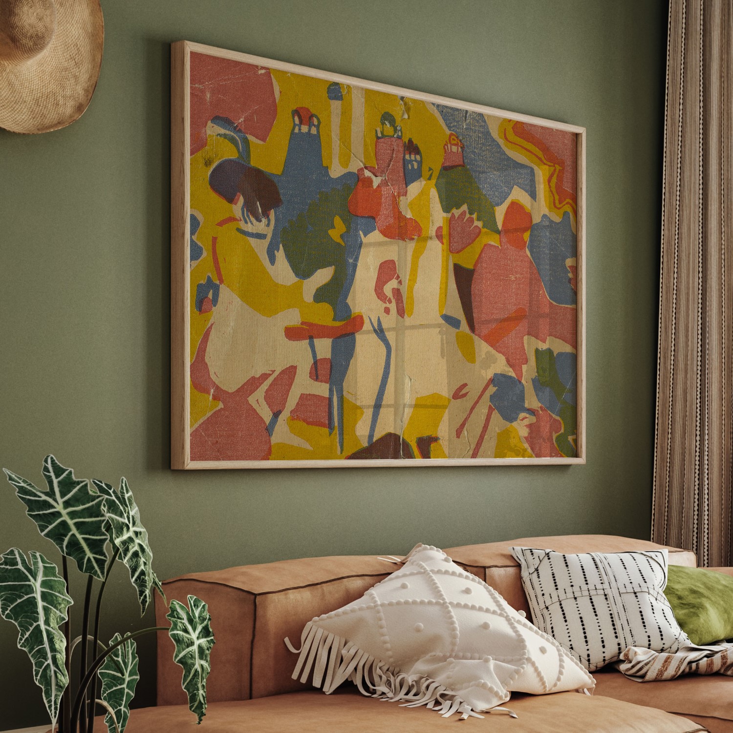
Choose The Colour Tone By The Room’s Job
Colour tone deserves its own decision here, separate from the composition question:
Muted and tonal picks - bedrooms, reading corners, focus-heavy offices. Where to look: the beige and warm-neutral abstract collection. Effect: low visual competition, easy to live under daily.
Bold, high-contrast picks - stairwells, entries, social living and dining rooms. Where to look: the black-and-colour abstract collection. Effect: the piece earns its three seconds of attention on the way past, instead of losing them.
Our abstract wall art collection is the place to shop either end of that scale in one browse, running from near-silent tonal fields to full-saturation gestural work, so you can pick the exact level of pull each room needs rather than settling for whatever reads as generically “abstract.”
If you’d rather spread the same decision across several smaller works instead of committing to one big anchor, that’s a genuine alternative - but it’s a different problem: arranging pieces so they read as one considered statement instead of five competing ones. Our gallery wall starter guide covers that layout math directly.
And if what you actually want is directional energy without giving up a recognisable subject altogether, the vastu tradition has an old, specific answer for that too. Running horses, angled toward the room rather than away from it, is the best-known version - our most-read piece on the blog walks through exactly why the horses painting works the way it does in vastu terms. For the colour side of the same question, room by room, see our colour psychology guide, and for what sightline and scale do to a wall, the psychology of art covers it wall by wall.
One more check before any of this goes up, regardless of style: framed canvas prints and their inks aren’t automatically neutral, and if the wall in question belongs to a child’s room, it’s worth confirming what’s actually in the piece before it’s mounted. Our guide to checking wall décor for safety walks through what to look for.
Buy the piece that goes with everything, and you’ll likely end up with a wall nobody notices. Buy the piece that matches what the room can actually spare, and you get a wall that does its job - whether that job is holding a stairwell’s attention for three seconds, or staying quiet enough to fall asleep under.
Frequently asked questions
What is abstract art, in simple terms?
Abstract art is art that doesn’t depict a recognisable person, place, or object - colour, shape, line, and gesture are the subject itself, not a stand-in for something else. It began around 1910 with painters like Kandinsky and Hilma af Klint, and today it spans everything from calm, tonal colour fields to high-energy gestural work.
Does abstract art actually affect a room’s mood?
Research on colour and visual complexity associates high-contrast, gestural marks with higher measured arousal, and muted, tonal work with lower arousal - that’s an association, not a proven effect, and no credible study claims art treats stress or anxiety. It’s still a useful, honest way to choose a piece.
Should abstract art match the room’s existing colours?
Not necessarily - matching everything is often the actual problem, since a piece picked purely to blend rarely earns a second look. Choose based on how much visual energy the room can spare instead: bold, high-contrast pieces for passage spaces, muted and tonal ones for rooms built around rest or focus.
How big should an abstract painting be over a sofa?
As a rough guide, the piece (or grouped arrangement) should span about two-thirds of the sofa’s width. For abstract work specifically, one appropriately large piece reads as more considered than two or three mid-sized ones, since a single anchor doesn’t compete with itself for the eye’s attention.
Is Indian abstract art different from Western abstract art?
Not fundamentally - both drop recognisable subjects in favour of colour and form. India’s version grew out of Bombay’s Progressive Artists’ Group, founded in 1947; painters like V.S. Gaitonde and S.H. Raza pushed furthest into pure abstraction, with Raza’s bindu drawing specifically on tantric geometry rather than European abstraction’s roots.