Show a swatch of pure yellow to a stranger in Mumbai, Nairobi or Oslo, and more of them say the same word: joy. Show black, and more say sadness. That pattern held up when researchers checked it against 128 years of published studies, 42,266 participants and 64 countries — a review large enough that the pattern stopped looking like an accident.
This piece rests on that review and two more like it: research that was careful enough, and large enough, to trust. Between them they establish what a colour actually signals to a person looking at it, and how much the room around it changes that signal. Neither finding promises a mood shift from a paint chip. Both are useful for a decision you’re about to make: which colour of wall art suits which room in an Indian home.
Colour Psychology Found One Reliable Fact In 128 Years Of Research
The largest review of colour-emotion research to date was published in 2025, in Psychonomic Bulletin & Review, by Domicele Jonauskaite and Christine Mohr. It combined 132 peer-reviewed studies — a systematic review run to PRISMA 2020 standard, meaning the search and selection process was documented and checked on its own terms — covering 42,266 participants across 64 countries and 128 years of published research.
Color Psychology Research Spanned 42,266 People Across 64 Countries
That scale is the point. A single study on forty undergraduates can produce a colour-mood finding that never repeats outside that room. A review spanning 128 years and 64 countries is a different kind of evidence — it tests whether an association holds up everywhere, not just in one lab. It did: yellow paired with joy, black paired with sadness, and light colours paired with positive feeling against dark colours pairing with negative feeling, consistently enough across the 64 countries that the authors called the pattern reliable.
Colour Associations Explain What A Colour Means To People
The review’s own summary line draws the boundary precisely: “we do not know if we feel colours, but we know that colours convey emotions.” That’s a claim about meaning, not effect. Blue carries a calm-and-trust association in the data. Green carries a nature-and-balance association. Red carries an energy-and-urgency association. None of that is the same as a blue wall calming the person who lives with it — participants were reporting what a colour means to them when asked, not what happened to their mood when they were exposed to it unasked. That distinction is the one this whole piece is built around.
A Room Changes How The Same Colour Feels, A 2021 VR Study Found
If colour carries stable meaning, the next question is where that meaning gets used — and a 2021 study out of Australia answered exactly that. Lipson-Smith and colleagues put 745 people into virtual reality and showed each of them the same set of colours rendered inside three different spaces: a living room, a hospital waiting room and a bare cube with no furniture at all (Virtual Reality). Each participant saw five of forty possible colours, assigned at random, and rated how the space made them feel.
The same colour, in a different room, produced a different mood and preference response — reliably enough that the researchers could rule out chance. Blue in a living room and blue in a waiting room weren’t rated the same way by the same kind of person. Worth naming plainly: this was a rendered room in a headset, not a real painted wall lived with over months, so treat it as evidence that room context changes colour response, not as a measurement of exactly how much.
That’s the practical hinge for the rest of this piece. The useful question isn’t what blue does to a person — the associations research above already answered that it signals calm and trust, not that it produces calm. The useful question is which room you’re hanging it in, and whether that room’s job matches what the colour signals. Living room, bedroom, dining room, office, kids’ room, entryway, bathroom — each asks something different of the wall.
Wall Art For A Living Room Does Two Different Jobs
A living room in most Indian homes does two jobs: it hosts guests some evenings, and it’s where the household unwinds the rest of the time. Wall art for a living room built mainly for company can lean into the associations that read as lively; wall art for a living room used mainly for quiet evenings can lean the other way.
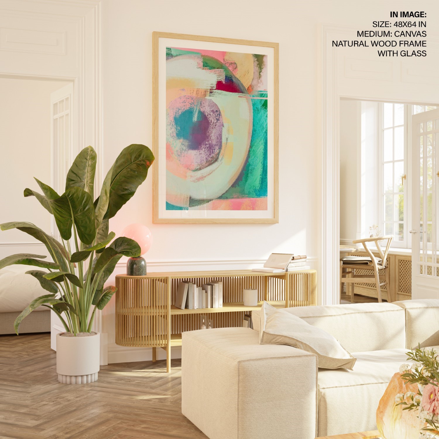
A living room built for hosting. Warm abstracts and reds read as energetic rather than restful — the association the Jonauskaite review found for that end of the spectrum — a fit for a room where people are usually standing, talking and moving through.
A living room used mainly for evenings in. Greens and cooler-toned abstracts carry the nature-and-balance association from the same review — closer to what a household actually wants from a wall it sits facing most nights of the year.
Wall Painting For A Living Room Should Match How Long People Sit In It
The Lipson-Smith finding above has a second use here: a living room is exactly the kind of context that study showed changes colour response, and a sofa wall gets lived with differently than a wall in a room you only pass through. Browse the green collection for the calmer end of this and the abstract collection for colour-forward pieces that read as energy rather than noise, or start from the living room wall art range and filter by colour from there.

Wall Art For Your Bedroom Should Lean Toward Calm Tones
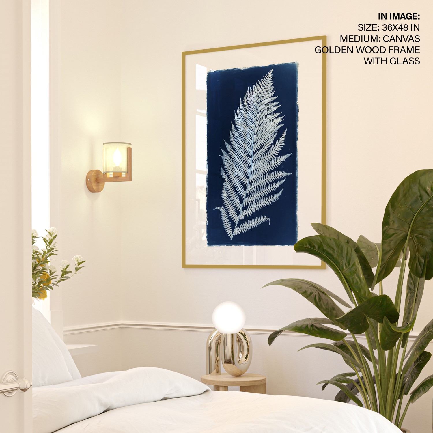
A bedroom wall does one job the living room doesn’t: it’s the last thing seen before sleep and the first thing seen on waking, viewed at low light and half-attention, every day, for years. Wall art for a bedroom is where the calm-and-trust association the Jonauskaite review found for blue, and the balance association it found for green, has its clearest use — not because either colour is proven to calm the person lying under it, but because both signal the kind of mood a bedroom is built for rather than one it isn’t.
Above the headboard. Blue and soft green pieces carry the calm-and-trust association most consistently across the 64 countries in the review — a closer match to a room meant for rest than a high-contrast warm abstract.
Vastu guidance for this same wall lands in a similar place for a different reason — see vastu paintings for the bedroom for the directional logic. Browse the blue collection and the green collection for this end of the room, or see everything sized for a headboard wall in bedroom wall art.

Your Dining Room Wall Can Carry More Energy Than Your Lounge
A dining table gets used in short, social bursts rather than the long solo evenings a sofa sees, which gives its wall room to carry warmer, more energetic associations than a living room built for quiet evenings needs.
A dining or kitchen wall. Reds, warm ochres and botanical pieces carry the energy-and-urgency association the Jonauskaite review found for that end of the spectrum — a fit for a room built around company rather than solitary rest.
Browse the botanical collection for the fresher, plant-forward version of this register, or the red and yellow collections for the warmer, higher-energy end a dining wall can carry.

Office Wall Art Should Set The Mood You Want At Your Desk
The same association logic applies to a desk wall as anywhere else in the house: blue and green read as calm and balanced, warmer tones read as energetic, and which one belongs depends on the kind of work that happens in the room. We go deeper on choosing for a home office specifically in how art affects your office space, and the office wall art range is filtered for desk-facing walls.
A Workplace Study Of 988 People Found Light Counts For More Than Colour
A 2006 field study in Ergonomics is worth knowing here because it was run in real workplaces, not a lab: 988 workers across four countries rated their own environment. Its clearest result was about light, not colour — mood was consistently better when workers judged the lighting in their space “just right,” and worse when it ran too dim or too bright. On colour, the authors were more careful: they wrote that thoughtful colour design might contribute to a better environment, not that their data showed it reliably did. Get the light right first. Treat the wall colour as the second decision.
A Kid’s Room Should Pair Colour Choice With Material Safety
The same colour-emotion associations apply to a child’s room as anywhere else — yellow reads as joyful and light tones read as positive, in the same 64-country data cited above. A child’s room adds one more consideration on top of colour: material safety, since non-toxic inks and materials carry more weight in a room a child spends unsupervised hours in. Is your wall decor toxic covers what to check before anything goes on that wall. Browse kids room wall art and the nursery range once the safety question is settled.
Your Entryway Can Wear The Boldest Colour In The House
An entryway gets seconds of attention from anyone passing through it, never the sustained sitting-and-facing-it that a sofa or a bed gets — the same room-context logic the Lipson-Smith study demonstrated, extended to a room type that study didn’t test directly.
Your entryway wall. Bold reds and colour-forward abstracts read as energy rather than noise here, because nobody stands in a hallway long enough to tire of a busy colour the way they would on a sofa wall.
Browse the abstract collection for a first-impression piece bold enough for this wall. How loud that piece can safely go — and why one bold piece per room beats three — is the subject of our guide to abstract art and energy.
A Bathroom Wall Should Read Clean And Fresh
A bathroom is a self-care room used in short, frequent visits, and that changes what the wall needs to do compared with a room someone sits in for hours.
Your bathroom wall. Blue carries the calm-and-trust association most consistently, paired in the same data with a sense of cleanliness — the most-reused colour family for this room, for good reason.
One practical note that has nothing to do with the research: humidity means acrylic or glass-framed prints hold up better here than an unprotected paper print. The blue collection is the obvious place to start for this room.
Vastu Painting Advice And Colour Psychology Point At Similar Walls
Vastu maps colour to direction on different grounds entirely — a north wall, tied to Kubera and the flow of wealth, calls for a water scene in blue and green; a south wall, tied to fire, calls for warmer reds. The colour-associations research above lands on close to the same colours for a different reason: blue and green carry the calm-and-trust association across the 64 countries in the Jonauskaite review, and red carries the energy-and-urgency association, independent of any direction at all. Neither system needs the other to be wrong for either to be right, and plenty of homes we work with use both without treating them as in conflict.
The overlap is easiest to see room by room. The bedroom guidance above, favouring calm blue and green above the headboard, matches vastu paintings for the bedroom, arrived at independently. The living-room advice sits next to vastu paintings for the living room. For the full directional logic across every wall in a home, see vastu paintings for home — and for the single most-read piece on this site, the seven horses painting and vastu covers the wall readers ask about most.
Choose Your Wall Art Colour By The Collection That Matches Its Room
Two findings hold this piece up. Colour carries agreed meaning — yellow reads as joy, blue as calm and trust, red as energy, consistently enough across 64 countries and 128 years of research that the pattern isn’t an accident. And the room changes how that meaning lands: a controlled study found the shift reliable enough to treat “choose per room” as a rule backed by data. Put the two together and the shopping decision gets simpler: name the room’s job first, then pick the colour whose association matches it.
Browse by that logic rather than by instinct alone. The green collection and blue collection cover the calmer end of this piece — living rooms built for evenings in, bedrooms, bathrooms. The abstract collection covers the energetic end — entryways, hosting-first living rooms, a desk wall that wants some life in it. The botanical collection sits between the two, useful anywhere a room wants freshness without full intensity. Start with the wall you already have, name what it’s for, and let that decide the colour — not the paint chip’s promise.
Colour is the first half of the decision. The second is which piece goes on which wall, and how big it needs to be — the sightline from your door asks for something different from the sightline above your bed. Our companion guide on the psychology of art covers that side, wall by wall, including the arithmetic for sizing a piece above a sofa.
Frequently asked questions
What does colour psychology actually prove about wall art? The largest review to date — 132 studies, 42,266 people, 64 countries — found that people consistently associate colours with emotions: yellow with joy, black with sadness, light tones with positive feeling. That’s a finding about what a colour signals to a viewer, not a promise about how it will change their mood.
Does the same colour feel the same in every room? No. A 2021 study put 745 people into virtual reality and showed them the same colours inside different room types. The same colour produced significantly different mood and preference ratings depending on which room it appeared in, which is why choosing colour for a room’s job works better than choosing by colour alone.
What colour works best on a bedroom wall? Blue and soft green suit a bedroom because both carry the calm-and-trust association found consistently across the colour-emotion research above — a closer match to a room built for rest than a high-energy warm abstract, which reads better on a wall you pass through than one you fall asleep facing.
Does office wall art affect how a workplace feels? A 2006 study of 988 workers in real offices across four countries found lighting quality made the clearest difference to mood — best when the light felt “just right,” worst when too dim or bright. The same researchers noted good colour design might contribute too, though their data spoke to light far more clearly than colour.
Can vastu colour advice and colour psychology research agree on the same wall? Yes. Vastu recommends blue and green water scenes for the north wall on directional grounds tied to Kubera; colour-association research favours similar colours because they carry a calm-and-trust association across cultures. The reasoning differs, but the wall they point to is usually the same one.