Two people can stand in front of the same painting — a canvas of deep blue water pooling under a waterfall — and want it for opposite reasons. One has read about attention and colour research and wants something calm for a home office that gets used all day. The other has a vastu chart and wants flowing water on the north wall, the direction of Kubera, to keep money moving through the house rather than sitting still. Neither is wrong. They are both about to buy the same picture for the same wall.
This piece sits between those two readers. It won’t settle which framework is correct — vastu isn’t something a blog post can adjudicate, and colour research has its own limits. It will lay out what each side actually claims, why blue behaves differently under Indian light than a paint chip suggests, and how flowing water and still water read differently once framed and hung.
What colour research actually says about blue
Colour-preference studies have asked people to rank hues by feeling for decades, and blue wins the calm-and-cool category more consistently than almost any other result in the field. Across cultures, ages and genders, blue is rated lower in arousal and higher in pleasantness than red, orange or yellow — the colour people reach for when asked to picture “a good place to concentrate,” not “a good place to celebrate.”
That’s an association, not a mechanism. No study shows a blue painting changing a viewer’s blood pressure. What the research does support is smaller and still useful: people consistently report feeling calmer around blue, and colour is one of the fastest things a brain reads in a room, faster than shape or subject. A blue canvas registers before a viewer has worked out what’s actually painted on it.
Water adds a second layer to that. Roger Ulrich’s often-cited 1984 study found that hospital patients recovering from surgery in rooms facing trees, rather than a brick wall, left hospital sooner and needed less pain medication than patients with the brick view — a finding about natural scenery in general, not water specifically, but it’s a large part of why “a view of nature” became shorthand for a restorative environment. Rachel and Stephen Kaplan’s attention-restoration theory built on the same idea: scenes with gentle, repetitive movement — leaves, clouds, water — hold attention without demanding effort from it, which is what lets an overworked, directed-attention system rest. A painting of a flowing river is doing, in a small and framed way, something close to what the Kaplans described nature doing at full scale.
Why blue goes cold on an Indian wall, and the fix
Blue behaves differently under Indian daylight than it does in a showroom in a cooler climate. Most Indian apartments get strong, warm, high-angle sun for part of the day and flat, cool light the rest of it — and a north-facing room, the wall vastu recommends for water art, gets almost none of the warm direct light at all. Under that flat light, a blue-grey seascape can read as simply grey by four in the afternoon. The blue drains out of it.
The fix sits in the surround, not the painting itself.
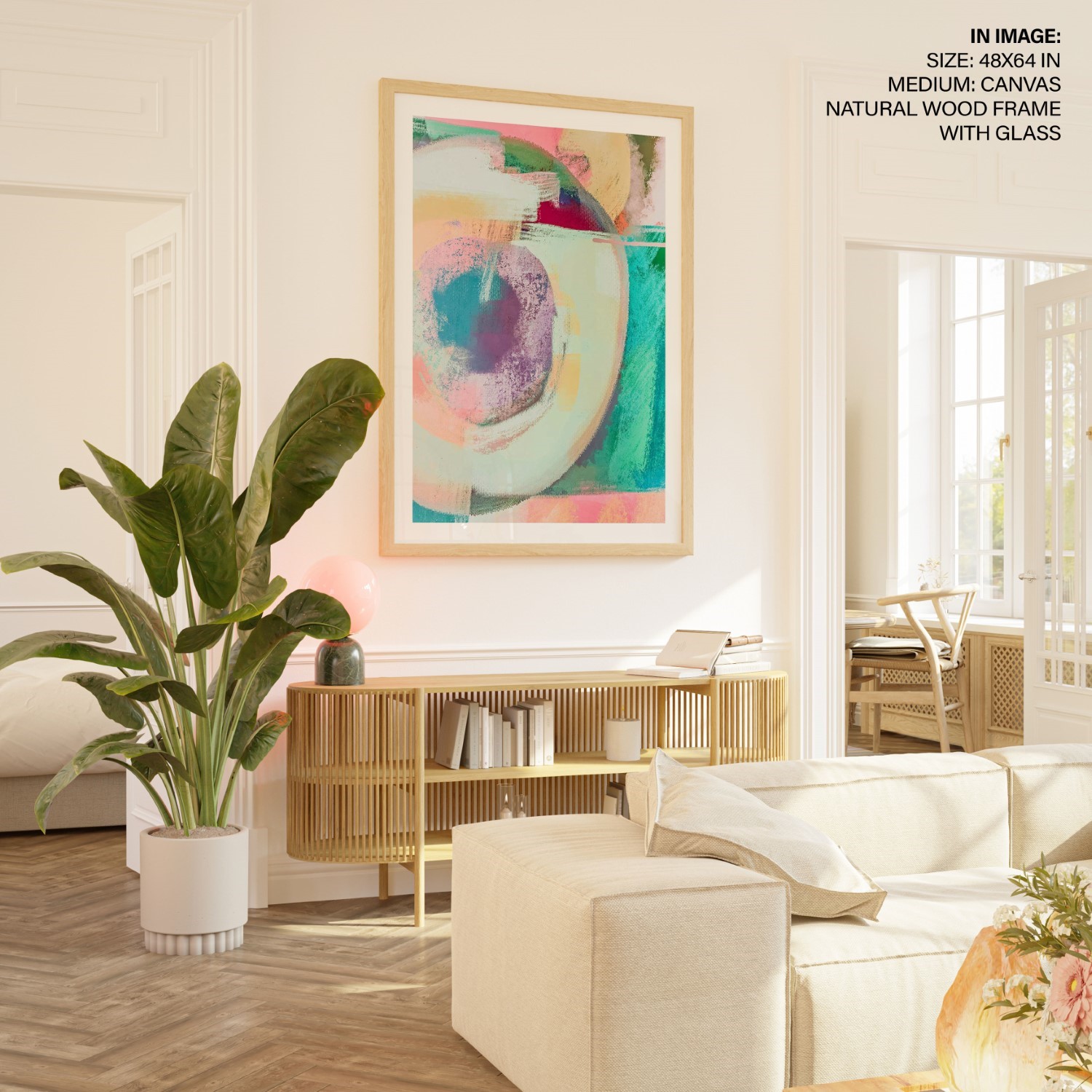
A warm wood frame — teak, walnut, a burnt-orange mango wood — pulls a cool canvas back toward warm and stops it looking sterile against white walls.
A warm-white bulb, 2700–3000K, angled onto the art from above restores the saturation that flat daylight took away. The blue-white 5000K bulbs most ceiling fittings default to do the opposite — they push a blue painting further toward grey.
A blue with some green or gold in it — teal water, an indigo cyanotype, a lake with warm light caught on the surface — holds its colour under grey daylight in a way pure ice-blue does not.
Water in motion versus water at rest
Not all water paintings do the same visual job; the difference is motion, not subject. A flowing river, a still lake and a breaking wave are three different experiences before direction or colour theory even enters the decision.
Flowing river or waterfall — implied motion, a sense of forward movement. Works in: living rooms, entryways, home offices, dining rooms — anywhere the eye can stay a little active. Vastu placement: the north wall, the direction most commonly linked to Kubera and financial flow.
Still lake or calm reflection — symmetry, stillness, low visual noise. Works in: bedrooms, reading corners, meditation spaces — anywhere the room’s job is to slow a person down. Vastu placement: often accepted in the north or northeast, though some practitioners reserve that wall for moving water only and treat still water as more neutral.
Breaking wave or stormy sea — high contrast, spray, drama at full volume. Works in: one statement wall in a living or dining room, where drama is the actual point. Avoid: bedrooms, narrow hallways, anywhere passed several times a day — this kind of energy doesn’t fade with familiarity the way a calmer scene does.
The mistake, when there is one, is rarely choosing water art. It’s choosing the wrong kind of water for the room.
What vastu adds to the same decision
Vastu shastra treats water as one of five elements and assigns it a direction: north, the zone linked to Kubera, the guardian of wealth in Hindu tradition. The reasoning, as it’s commonly taught, is that flowing water on that wall represents money moving through a household rather than pooling in one spot — which is why a river or a waterfall, not a still pond, is the traditional recommendation for that position. Our guide to vastu paintings for the home walks through the full wall-by-wall logic; if you’re specifically weighing a waterfall against other water scenes, our waterfall painting and vastu guide covers that placement in more depth.
None of that is a claim this piece can verify or challenge — it’s a description of what the tradition holds, the same way summarising a colour study is a description of what that study found. What’s worth noticing is where the two frameworks land once the description is done.
Where the two readers end up on the same wall
A vastu-led buyer chooses a flowing river for the north wall of the living room because the tradition ties that direction to wealth in motion. A colour-research-led buyer chooses the same painting for the same wall because the living room gets the most waking hours in the house, and a calm colour does more good there than in a bedroom spent half-asleep. Different vocabularies — flow and fortune against arousal and attention — same canvas, same wall, reasons that don’t actually contradict each other.
The bedroom is where the two views separate. Vastu guidance for bedrooms generally steers away from large water scenes, associating moving water with restlessness in a room meant for sleep. Colour and attention research reaches the same caution from a different direction: a highly dynamic image is a poor choice for the last thing a person sees before closing their eyes and the first thing they see on waking. Two frameworks, no shared vocabulary, the same conclusion. Our guides to vastu paintings for the bedroom and vastu paintings for the living room go deeper on placement, room by room.
The one mistake: a crashing wave across from the bed
If this guide has a single wrong answer, it’s this one. A large, high-contrast seascape — breaking waves, spray, storm light — hung directly opposite the bed is the most common water-art mistake we see, and it fails both readers at once. It’s the first thing seen on waking and the last thing before sleep, and a scene built around motion and drama doesn’t recede into the background the way a calmer image does. Vastu guidance for bedrooms already discourages large, turbulent water in that position; colour and attention research flags the same painting for a related reason, in different words — high visual energy at the two moments a bedroom should be at its lowest.
The answer isn’t to skip water in the bedroom. It’s to choose the still version — a calm lake, a quiet reflection, low-contrast blue-green tones — and hang it to the side of the bed or behind the headboard rather than facing it directly.
Picking the actual piece
Once the room and the water type are settled, the shopping decision comes down to undertone and size.
For a north-facing living room or home office, a flowing river or waterfall in warm-toned blues, framed in wood, sized to fill roughly two-thirds of the wall width above the furniture line, does the job vastu asks of that wall. Browse the waterfall collection for the flowing-water option that direction calls for.
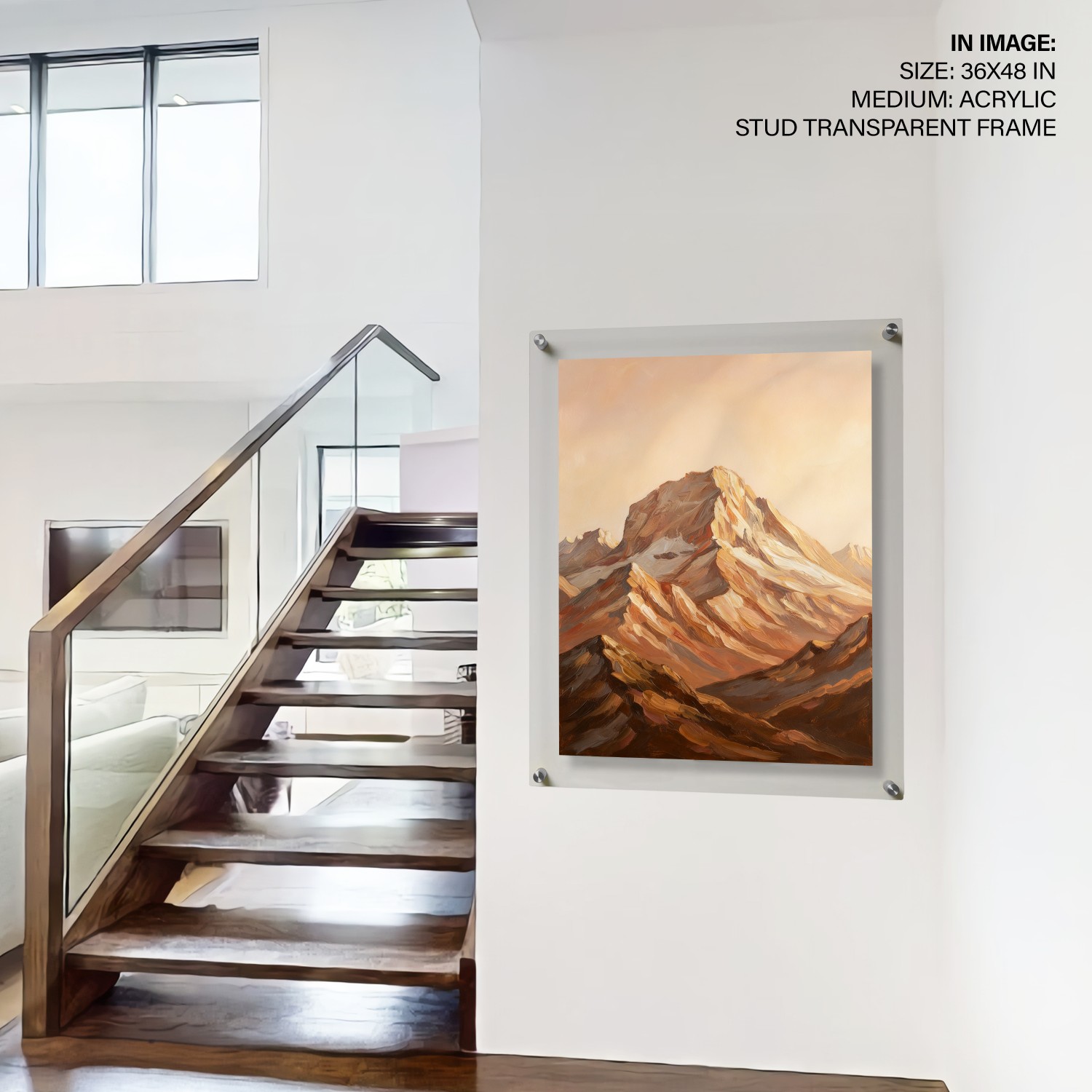
For a bedroom or reading corner, a still lake or a quiet mountain-water scene, smaller and in a plainer frame, hung where it’s seen in passing rather than stared at from bed, suits the room better than anything dramatic. The mountains collection carries several lake-and-peak scenes with the low-contrast stillness this spot calls for.
For any room where the calm-blue association is the actual goal, without committing to a literal water scene, an abstract, a botanical print or a cyanotype in indigo does the same colour work without the vastu-specific water symbolism attached. The full blue wall art collection is the place to browse that range.
If you’re building a full wall rather than hanging a single piece, our gallery wall starter guide covers mixing a blue anchor piece with smaller prints around it. And if focus is the actual goal rather than a side benefit — a home office, a desk in the corner of a bedroom — our longer piece on how art affects a workspace is worth the extra read.
One more note for the evidence-led reader: colour is only part of what makes a piece of art suited to a room. If off-gassing, ink safety or PVC content matters to you too, especially for a nursery or a bedroom, that’s a separate question from colour psychology, and we’ve covered it on its own in is your wall decor toxic.
Stand back from both frameworks and the decision gets smaller than it looked at the start. Buy a blue worth living with for the next ten years. Match the water’s motion to the room’s actual use — moving water where the day is busy, still water where you sleep, nothing turbulent across from the bed. The vastu reader and the colour-research reader end up buying the same painting for the same wall. They just describe it differently.
Frequently asked questions
Does blue actually make a room calmer, or is that just marketing? Blue is one of the most consistently replicated findings in colour-preference research — people rate it lower in arousal and higher in pleasantness than warm colours, across cultures. That’s a real, repeated association, not a guarantee. It’s a reason to lean toward blue in a room built for calm, not a promise the colour alone changes how you feel.
Which wall should a water painting go on, according to vastu? Vastu shastra most commonly places flowing water — a river or waterfall — on the north wall, the direction associated with Kubera and financial flow. Still water is treated more loosely: some practitioners allow it in the north or northeast, others reserve that wall for moving water only. Check with a practitioner if you’re following vastu strictly.
Can I hang a waterfall or ocean painting in the bedroom? Both traditions lean the same way: keep it calm, not turbulent. A still lake or low-contrast water scene works fine in a bedroom. A large, high-drama seascape directly opposite the bed is the most common water-art mistake we see — it’s visually active at the two moments a bedroom is supposed to be quietest.
Why does my blue painting look grey instead of blue? North-facing Indian rooms get flat, cool daylight with almost no warm direct sun, and that light desaturates cool blues fast. A warm wood frame and a 2700–3000K bulb angled onto the piece restore most of the lost colour. A blue with some green or gold in it — teal, indigo — also holds up better than icy blue-grey.
What’s the difference between a still lake painting and a flowing river painting for a living room? Mostly motion. A flowing river or waterfall keeps the eye moving and suits busy rooms — living rooms, home offices, entryways. A still lake is quieter and lower-contrast, better for a reading corner or bedroom. Vastu treats moving water as the wealth-corner choice; colour research treats it as the higher-energy one — same distinction, different vocabulary.
Is a water painting a bad idea in the kitchen, since fire and water clash in vastu? Yes, that’s a common vastu caution — water imagery is generally kept away from the kitchen’s fire zone, since the two elements are considered opposing. If you want a blue accent there, a non-water blue piece, like a botanical print or an abstract, gives you the colour without the water symbolism.