Wall Art by Colour: The Complete India-Focused Guide
Table of Contents
- Why colour matters in wall art
- Colour psychology in Indian interior design
- How different colours influence mood, energy, and behaviour
- Best colours for each room in an Indian home
- Choosing wall art colours based on age groups
- Popular wall art colour themes in modern India
- Matching colour-based wall art with interior styles
- Pairing coloured art with furniture, décor, and lighting
- Indian cultural symbolism behind common colours
- Installation and placement tips for colour harmony
- Expert styling tips to choose the right colour palette
- Why colour-based wall art is becoming popular in modern Indian décor
Wall Art by Colour: The Complete India-Focused Guide
1. Why colour matters in wall art
Colour is one of the strongest emotional triggers in interior design. Wall art acts as a visual anchor, and the colours you choose set the tone of the room—calming, energising, luxurious, playful, or dramatic. In Indian homes, where colour traditionally plays a major role in festivals, clothing, and culture, colour-based wall art adds both personality and emotional balance.
2. Colour psychology in Indian interior design
Colour psychology studies how colours influence mood and perception. In India, this psychology is deeply intertwined with cultural meanings:
- Yellow: Auspiciousness, warmth, positivity
- Red: Energy, passion, celebration
- Blue: Calm, stability, divinity
- Green: Growth, healing, nature
- White: Serenity, purity, simplicity
- Black: Depth, grounding, sophistication
- Gold: Prosperity, luxury, grandeur
Understanding these associations helps in choosing the right colour for your wall art.
3. How different colours influence mood, energy, and behaviour
Warm Colours
- Red: Stimulates energy, conversation, appetite; strong focal point
- Orange: Creativity, friendliness, enthusiasm
- Yellow: Happiness, clarity, optimism
Cool Colours
- Blue: Calming, good for sleep, concentration, and emotional balance
- Green: Healing, freshness, ideal for stress-free environments
- Purple: Luxury, spirituality, imagination
Neutral Colours
- White: Clean, spacious, peaceful
- Grey: Sophisticated, modern, versatile
- Brown: Comforting, grounding, earthy
Bold Colours
- Black: Dramatic, elegant, powerful—as long as it’s balanced
- Gold: Festive, rich, royal
Colour choice influences behaviour—perfect for tailoring wall art to purpose-driven spaces.
4. Best colours for each room in an Indian home
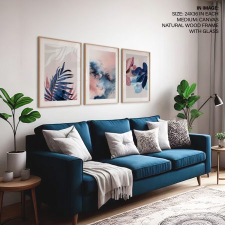
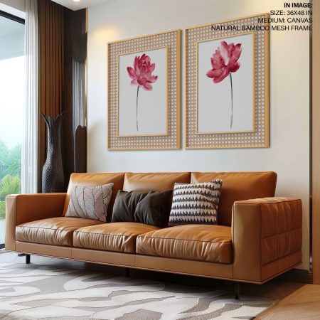
Living Room
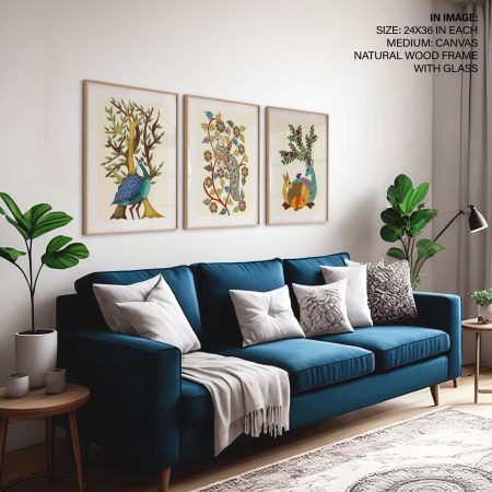
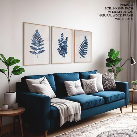
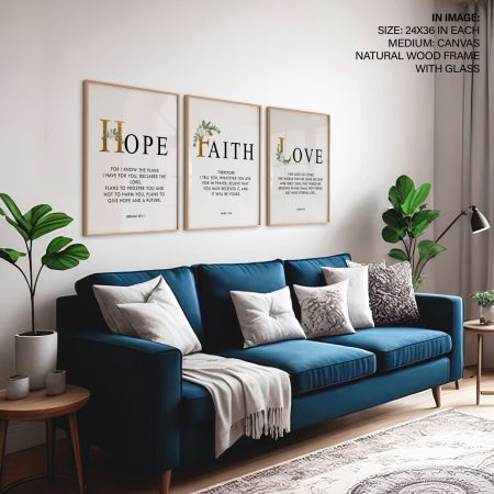
- Best colours: Blue, beige, brown, terracotta, navy, gold
- Why: Creates warmth, sophistication, and conversation-friendly energy
- Style notes: Choose artwork that complements upholstery and large furniture pieces.
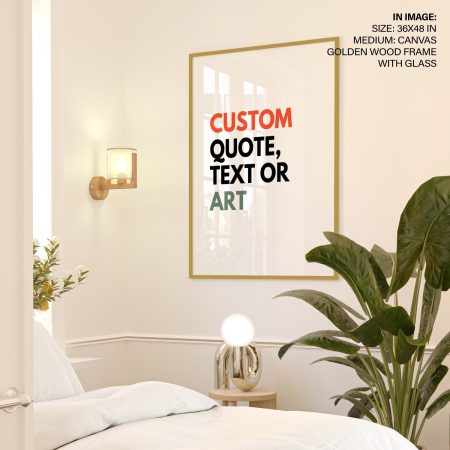
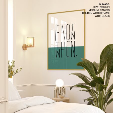
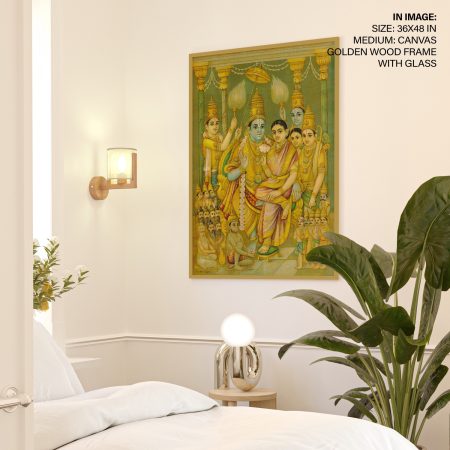
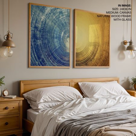
Bedroom
- Best colours: Sage green, blush, pastel blue, lavender, muted grey
- Why: These shades support relaxation and better sleep
- Style notes: Keep tones soft; avoid aggressive reds here.
Dining Room
- Best colours: Deep green, mustard, terracotta, warm neutrals
- Why: These enhance appetite and create a cozy dining ambience
Kitchen
- Best colours: Citrus tones, greens, minimalistic neutrals
- Why: Clean, bright, uplifting tones feel fresh and energetic
Kids’ Room
- Best colours: Sky blue, soft yellow, mint, pastel pink, peach
- Why: Encourages creativity without overstimulating
Workspace / Home Office
- Best colours: Blue, sage green, charcoal, beige
- Why: Improves focus, clarity, and mood
Puja Room
- Best colours: White, yellow, gold, saffron
- Why: These shades support purity and spiritual calmness
5. Choosing wall art colours based on age groups
Children (0–10 years)
- Bright colours: Yellow, sky blue, soft pink, green
- Encourage creativity, joy, and learning
- Avoid overstimulating neon tones
Teenagers
- Trend-friendly colours: Navy, teal, purple, monochrome, earthy tones
- Support independence and self-expression
Adults
- Balanced palettes: Blue, sage, beige, terracotta, charcoal
- Ideal for stress relief and grounding
Elderly
- Comforting tones: Warm greys, pastels, muted greens
- Promote relaxation and avoid visual noise
6. Popular wall art colour themes in modern India
- Neutral Minimalism: Greys, beiges, whites
- Earthy Naturals: Terracotta, olive, rust
- Royal India: Gold accents, navy, maroon
- Contemporary Abstracts: Black & white, monochrome gradients
- Botanical Colours: Greens, browns, soft florals
- Boho Colour Mix: Pastel + earthy combinations
- Vastu-inspired colours: Blues for north, greens for east, yellows for west walls
These trends reflect India’s shift towards modern yet culturally rooted home décor.
7. Matching colour-based wall art with interior styles
Modern Interiors
- Best colours: Black, white, grey, navy
- Abstracts and minimal shapes work well
Scandinavian Interiors
- Best colours: Soft pastels, muted greens, warm whites
- Subtle botanical or line art pieces fit perfectly
Bohemian Indian Interiors
- Best colours: Terracotta, mustard, teal, earthy tones
- Hand-drawn, textured, nature-inspired art works beautifully
Luxury Contemporary
- Best colours: Gold, charcoal, emerald green, sapphire blue
- Large statement pieces with metallic accents
Traditional Indian Homes
- Best colours: Maroon, mustard, deep green, gold
- Mandalas, folk art prints, and heritage-inspired palettes
8. Pairing coloured art with furniture, décor, and lighting
- Match the dominant colour of your artwork with cushions or rugs
- For bold art, use neutral furniture to balance the space
- Use warm lights for earthy tones and cool lights for blues and greys
- Metallic-framed art pairs well with contemporary luxury interiors
- Repeating accent colours across small décor items creates cohesion
Colour harmony is key to making wall art feel intentional and premium.
9. Indian cultural symbolism behind common colours
- Red: Weddings, festivals, strength, energy
- Yellow: Positivity, purity, beginnings, prosperity
- Green: Harvest, fertility, growth, peace
- Blue: Lord Krishna’s calmness and cosmic energy
- White: Spiritual purity, simplicity
- Gold: Royalty, wealth, divine luxury
- Saffron: Courage, spirituality, sacrifice
These symbolic associations help create emotionally meaningful interiors.
10. Installation and placement tips for colour harmony
- Place warm-coloured art where you want energy and conversation
- Use cool colours in resting zones
- Avoid mixing too many colour families in the same room
- Place high-contrast pieces on plain walls for maximum effect
- Ensure artwork height aligns with eye level (57–60 inches from the floor)
Correct placement amplifies colour impact and visual balance.
11. Expert styling tips to choose the right colour palette
- Pick artwork colours based on your room’s soft furnishings
- Create a “three-colour rule”: primary, secondary, and accent
- Use monochrome for minimal elegance
- Use triadic colours (three colours evenly spaced on the colour wheel) for creative vibrance
- For small rooms, choose light tones; for large spaces, go bold
- Ensure the art supports—not fights—the room’s existing palette
12. Why colour-based wall art is becoming popular in modern Indian décor
- Growing awareness of colour psychology
- Compact homes need visual guidance for balance
- Lifestyle shifts toward calm, mindful spaces
- Interior designers increasingly emphasise colour zoning
- Online shopping has made curated, colour-based art accessible
- Indian homeowners now seek harmony and storytelling—not just decoration
Colour-based wall art helps create emotional, aesthetic, and spiritual alignment within the home, making it one of the most transformative décor elements today.